Conversation
Generated component following the Webflow code components scaffold pattern.
Includes full and simple prop surface variations.
PreviewLight Theme
Dark Theme
Brand Theme
Visual Verification Score: 92/100 (passed) |
|
Review the following changes in direct dependencies. Learn more about Socket for GitHub.
|
|
Warning Review the following alerts detected in dependencies. According to your organization's Security Policy, it is recommended to resolve "Warn" alerts. Learn more about Socket for GitHub.
|
Co-Authored-By: Claude Opus 4.6 <noreply@anthropic.com>
1 participant
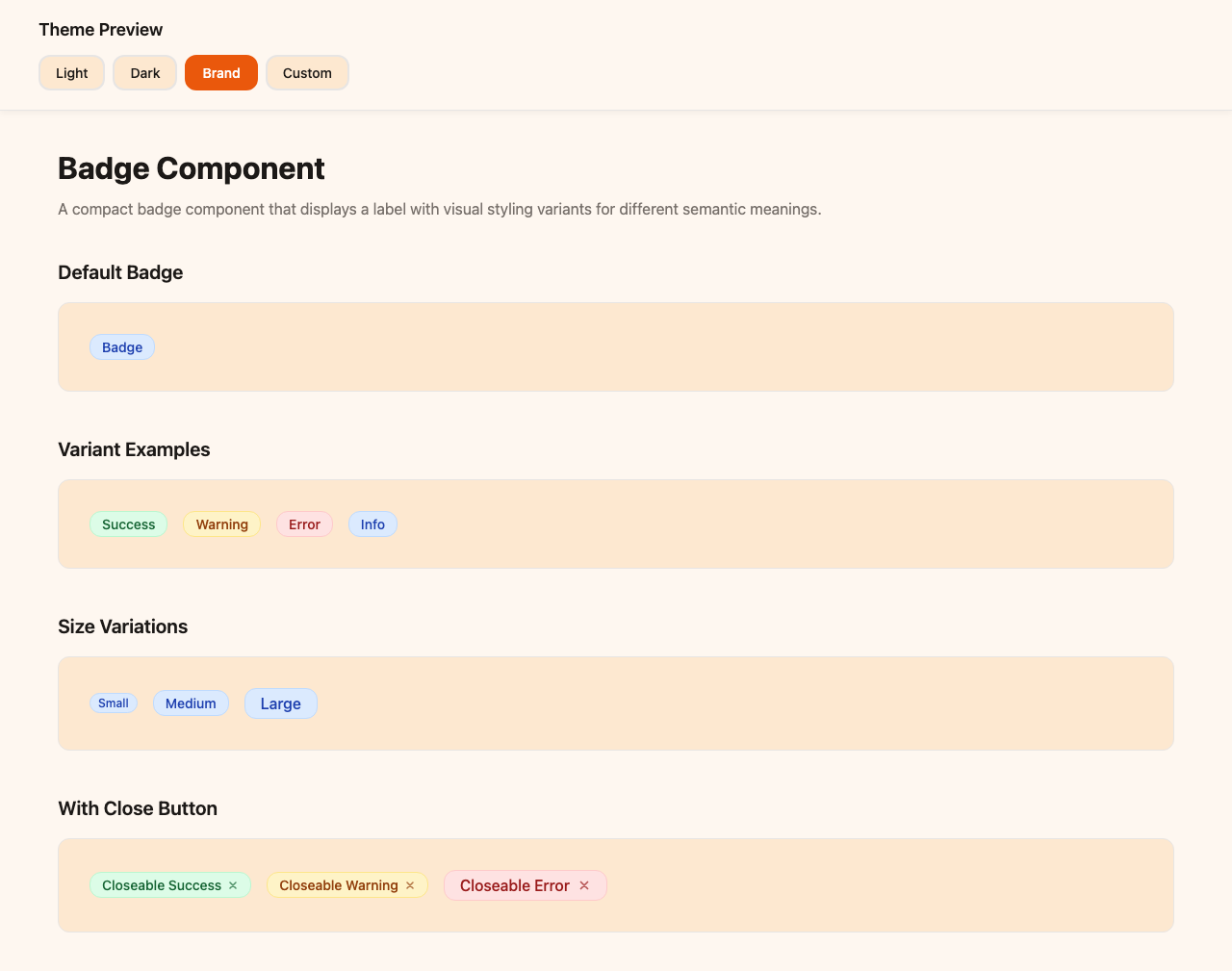
Component: Badge
Description
A compact badge component that displays a label with visual styling variants for different semantic meanings. The badge supports four color variants (success, warning, error, info) that apply appropriate background and text colors. Includes an optional close button that appears on the right side when enabled. The component is inline-block by default and works well for tags, status indicators, categories, and labels. The close button includes hover states and can trigger custom actions.
What's Included
var(--background-primary, #ffffff), etc.font-family: inherit; color: inherit;Badge.webflow.tsx) — 20+ props for developers/agenciesBadgeSimple.webflow.tsx) — core text/link props for clientswf-badge-for Shadow DOM safetyTesting
npm install && npm run devruns locallynpx webflow library shareimports successfully